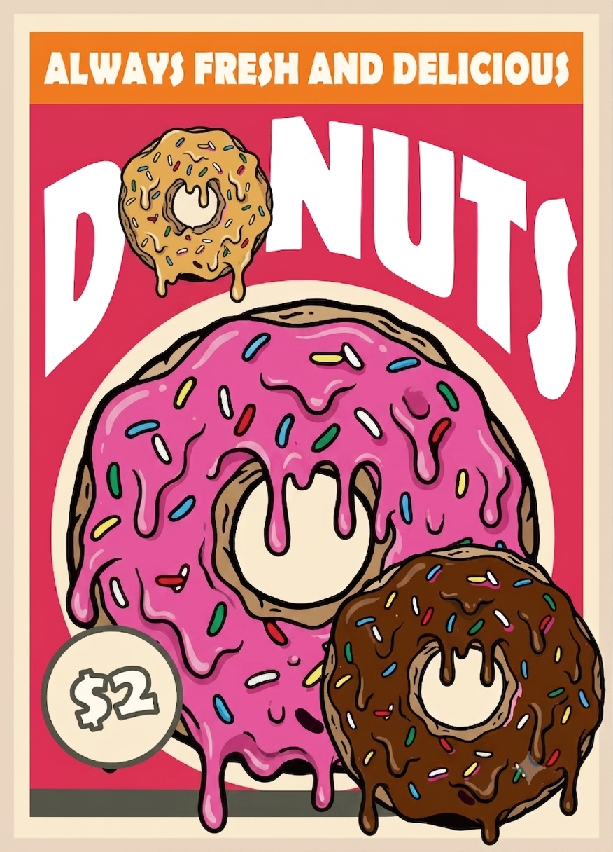
Mul poster
Working on this donut poster design in Affinity was quite a challenge and really tested my patience. The hardest part was definitely crafting the natural-looking glaze drips, which required precise adjustment of nodes and curves using the pen tool.
Beyond the melting effect, building the bold pop-art outlines and placing the colorful sprinkle details demanded extra attention to detail. Every layer had to sit perfectly to keep the overall look sharp, clean, and punchy.
Even though the process was tricky and definitely gave my fingers a workout, seeing the final result made it completely worth it. All that effort in Affinity paid off with a crisp, vibrant poster that really pops!